2. Optimal reading distance index
Topic: Learn how to ensure optimal readability of your scientific poster in the conference hall.
PosterGenius™ lets you know not only if your poster will be easy to read, but also indicates the typical distance one has to stand in front of the poster to read it easily. If this typical distance is not appropriate for a conference hall, PosterGenius™ warns the user to make necessary corrections.
Legibility of your scientific poster
Legibility of your content depends on the font size and a variety of other typographic parameters such as line spacing, paragraph indent etc. PosterGenius™ templates set the values of these parameters automatically optimizing the poster's readability in the conference hall. Thus by appling a template you do not have to worry about readability issues.
However, you can modify the default values of font size and typographic parameters either automatically (Fitting the content to the available poster surface), or manually Adjusting the font size).
If you have modified the typographic parameters of your scientific poster with one the ways mentioned above, in order to prevent your poster from becoming difficult to read in the conference hall, PosterGenius™ informs you in real-time about the Optimal Reading Distance.
Optimal reading distance
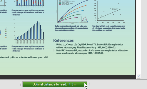
- Spot the optimal reading distance index at the bottom of PosterGenius™ workspace.

- This index informs you about the ideal distance one has to stand before the poster in order to read it easily. If the distance is appropriate for a conference hall, the value appears in a green background.

- When you change the font size with any of the above mentioned ways, PosterGenius™ automatically recalculates the optimal distance to read. If the new distance is not appropriate for a conference hall, the distance index changes color to warn you know about readability issues.
- Thus, if font size is such that the optimal reading distance is slightly bigger than the recommended one for a conference hall, the index turns orange. For example, suppose that font size is that big that the optimal reading distance is 3 m, which is quite big for a conference hall. The optimal reading distance turns orange to let you know that it is recommended to slightly decrease font size.

- If the optimal reading distance is far the recommended one for a conference hall, the index appears to be red. For example, suppose that font size is so small that the ideal reading distance is less than 0.5 m which is quite short for a conference hall. The reading distance index turns red to let you know that it is recommended to increase font size in order to make your scientific poster easier to read in a conference hall.

Related tutorials
Note: To view the tutorials you will need Adobe Reader or any other application that can open PDF files.
Adobe Reader is available for free download from Adobe Systems, Inc.: www.adobe.com


